Site Customisation
This section does not apply to Shopify. For information about Shopify, see Shopify Native. |
Welcome Pop-Up: Design and Configuration
Global-e’s Welcome Pop-Up allows merchants to present localized and branded messaging to shoppers upon arrival. This page provides a system description and a configuration procedure.

Caution
If you edit the text in one of the language versions, the text edits are only applied to that specific language version - the text in the other language versions remains unchanged. To avoid having language versions with inconsistent text, when you edit the text of a specific language, apply the same (translated) text edits to the remaining twenty-six languages.
Three placeholders for automatic text (Country, Shipping message, and Duties payment message) are incorporated in the default text. We advise that you use our automatic text bullets to convey to your shoppers a clear message about their shipping options as well as tax and duty payment.
1. System Description
1.1 Overview
The Welcome Pop-Up displays a localized message to shoppers when they land on your store, helping communicate delivery eligibility, duties and tax logic, and any free-shipping thresholds. The pop-up supports full branding customization on desktop and limited, fixed-size customization on mobile.
1.2 Pop-Up Types
Desktop Pop-Up: A customizable pop-up supporting brand styling for fonts, images, background, and interactive elements.
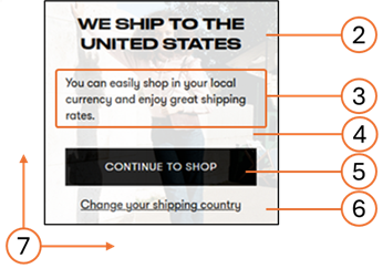
Mobile Pop-Up: A simplified pop-up with fixed dimensions optimized for mobile devices.
Note
Following Google’s 2017 Mobile Pop-Up Penalty, the mobile pop-up is disabled by default. Merchants who enable it must comply with Google’s “non-intrusive” guidelines.
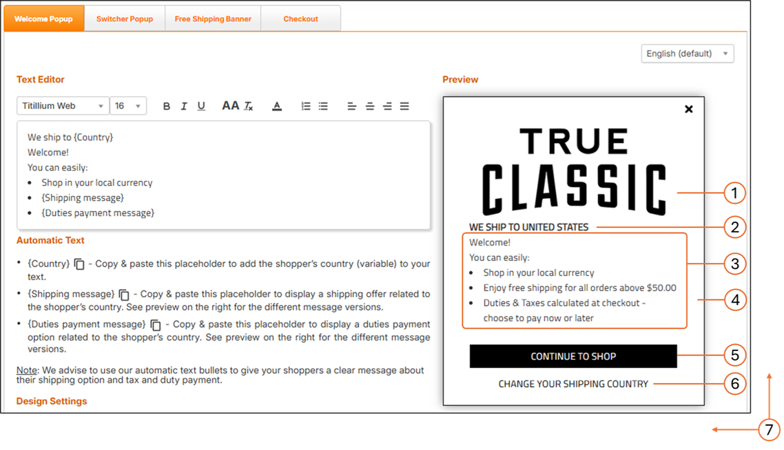
The following figure shows the Welcome Pop-Up screen on Desktop:
The following figure shows the Welcome Pop-Up screen on Mobile:
1.3 Customizable Elements
The following table lists the customizable elements for Desktop and Mobile Welcome Pop-Ups.
# | Element | Customizable |
|---|---|---|
1 | Logo | Image |
2 | Title | Font style, font size, font color |
3 | Message text | Font style, font size, font color |
4 | Background | Background color, background image |
5 | Action Button | Font style, font size, font color; button color; button width; button height; button location coordinates (left, top) |
6 | Link | Font style, font size, font colour; link location coordinates (left, top) |
7 | Size | Pop-up height; Pop-up width |
1.4 Localization Notes
The Welcome Pop-Up supports 27 languages. Edits made to one language do not update the others. For consistency, apply translated changes manually across all language versions.
1.5 File Format Requirements
Deliver your mock-up in one of the following formats:
PSD
XD
Online design (e.g., Zeplin)
Image (PNG or JPEG recommended; other formats supported)
PDF
1.6 Recommended Screen Dimensions
Desktop:
Element | Full Client Screen Size | Element Size |
|---|---|---|
Checkout / Confirmation | W: 1920 × H: 1080px | W: 1000px – auto height |
Welcome / Switcher pop-ups | W: 1920 × H: 1080px | W: 550 × H: 500px |
Mobile:
Element | Screen Width | Element Size |
|---|---|---|
Mobile Welcome Pop-Up | 375 px | 340 × 180 px (fixed) |
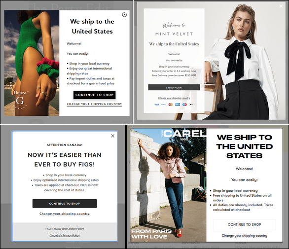
1.7 Examples
This section may include branded examples of desktop and mobile Welcome Pop-Ups.
2. Configuring Your Welcome Popup Page
Caution
If you edit the text in one of the language versions, the text edits are only applied to that specific language version - the text in the other language versions remains unchanged. To avoid having language versions with inconsistent text, when you edit the text of a specific language, apply the same (translated) text edits to the remaining twenty-six languages.
Three placeholders for automatic text (Country, Shipping message, and Duties payment message) are incorporated in the default text. We advise that you use our automatic text bullets to convey to your shoppers a clear message about their shipping options as well as tax and duty payment.
Follow steps 1 and 2 in Accessing the Customization Page.
Modify the following elements:
Default language setting menu located above the Preview panel.
The English language version of the Welcome pop-up is viewed by site visitors from countries that do not have a localized (translated) version of the pop-up.
Automatic text (optional) to be used in your welcome popup message:
{Country} parameter: Informs shoppers that the goods can be delivered to their country.
{Shipping message} parameter: informs shoppers about the lowest cart range required to qualify for free shipping to their country.
{Duties payment message} parameter: informs shoppers about the duties payment option required for their country during checkout.
Note
When a customer visits your store, Global-e detects their location and automatically inserts the country name, and displays the relevant messages regarding shipping and duties & taxes.
Design settings (show/hide your logo).
Preview options:
Free shipping:
Available - Minimum order required for free shipping. Default message: Enjoy free shipping for all orders above $x
Unavailable - Free shipping not available. Default message: Enjoy our great international shipping rates
To all - Free shipping on all orders. Default message: Free shipping to (your country) on all orders
Duties at checkout:
Payable - Duties are displayed separately at checkout with the option to prepay. Default message: Duties & Taxes calculated at checkout - choose to pay now or later
Hidden - Duties are incorporated in the product price. Default message: All Duties & Taxes are already included - no hidden fees
Partial - Duties are incorporated in the product price, with taxes displayed separately at the checkout with the option to prepay. Default message: All duties are already included. Taxes calculated at checkout
Button message and formatting.
Normal and hover mode text, body, and border color settings.
Note
You can reset your settings to their default configurations by clicking Reset to default at the bottom of the page.
Design: Country Switcher Pop-up
For added convenience, Global‑e offers the option to customize the appearance and content of the Country Switcher, aligning it with your brand identity and design.
Country Switcher Structure
The following figure shows the structure of the Country Switcher customisable elements.
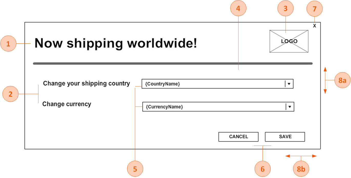
Country Switcher Customisable Elements
The following table lists the Country Switcher pop-up elements that can be customised.
Note: If fonts are not Google fonts, the merchant has to provide the font files in ttf /otf format
# | Element | customisable |
|---|---|---|
1 | Title | Font style, font size, font colour |
2 | Text | Font style, font size, font colour |
3 | Logo | Image |
4 | Background | Background colour, background image |
5 | Drop-downs | Font style, font size, font colour, arrow style, background colour, location (next to the text/below the text) |
6 | Buttons | Each button can be customised differently Font style, font size, font colour, button colour, button width, button height, button location coordinates (left, top) |
7 | X (close) button - on/off | If the X button is part of the pop-up, the image of the button can be part of the background image, and button location coordinates (left, top). |
8 | Size | 8a. Pop-up height 8b. Pop-up width |
File Format
Make sure to deliver the mock-up in any of the following file formats:
PSD
XD
Online design (example: https://zeplin.io/)
Image (recommended: JPEG or PNG. Other formats are also supported.)
PDF
Recommended Screen Dimensions for Desktop
The following table lists the Global‑e element dimensions recommended for the country switcher pop-up on desktop screens.
Desktop Dimensions
Element | Full Client Screen Size | Element Size |
|---|---|---|
Switcher pop-ups | W: 1920 X H: 1080px | W: 550 X H: 500px |
Recommended Screen Dimensions Mobile
The following table lists the Global‑e element dimensions recommended for the switcher pop-up on mobile screens.
Note
The height of the mobile screen adjusts dynamically to the contents of the checkout and confirmation screens per specific device. (The checkout page has more content than the confirmation page; the height adjusts accordingly). Therefore, the value of the screen's height is not required.
Mobile Dimensions
Element | Screen/Pop-up Width (px) (*) | Element size |
|---|---|---|
Switcher Mobile Pop-up | W: 375px | W: 340 X H: 285 |
Country Switcher Pop-Up Examples
This section provides customisation examples of the Country Switcher popup.
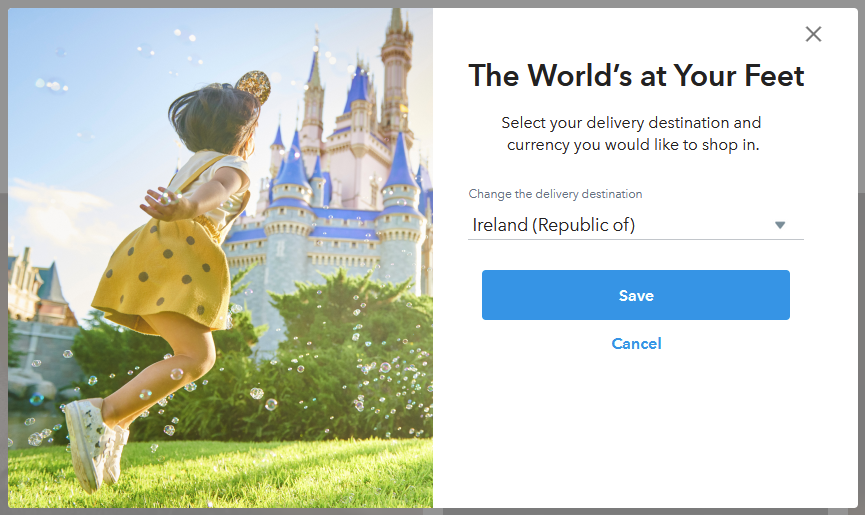
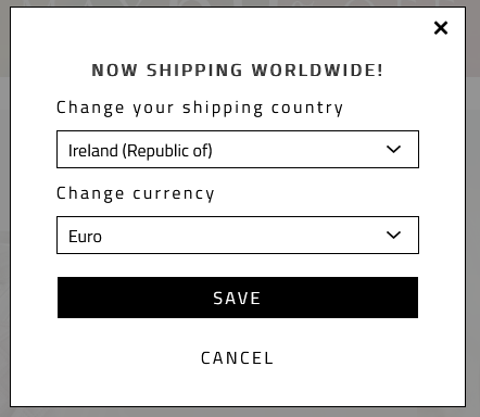
Country Switcher and Welcome Pop-up Combined
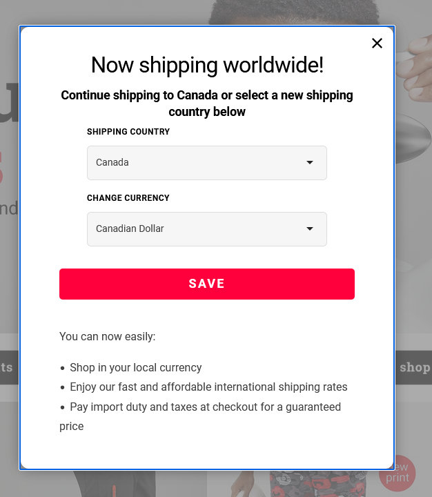
Page Design
Customizing the Checkout and Confirmation Pages
This section details the items that are customisable on both the Checkout and Confirmation pages.
You can use this Figma page to make any customizations that you require. Duplicate and modify the file as needed.
Note
The checkout page layout is fixed (it cannot be changed).
For information about customizing your Checkout page, see Configuring Your Checkout Page.
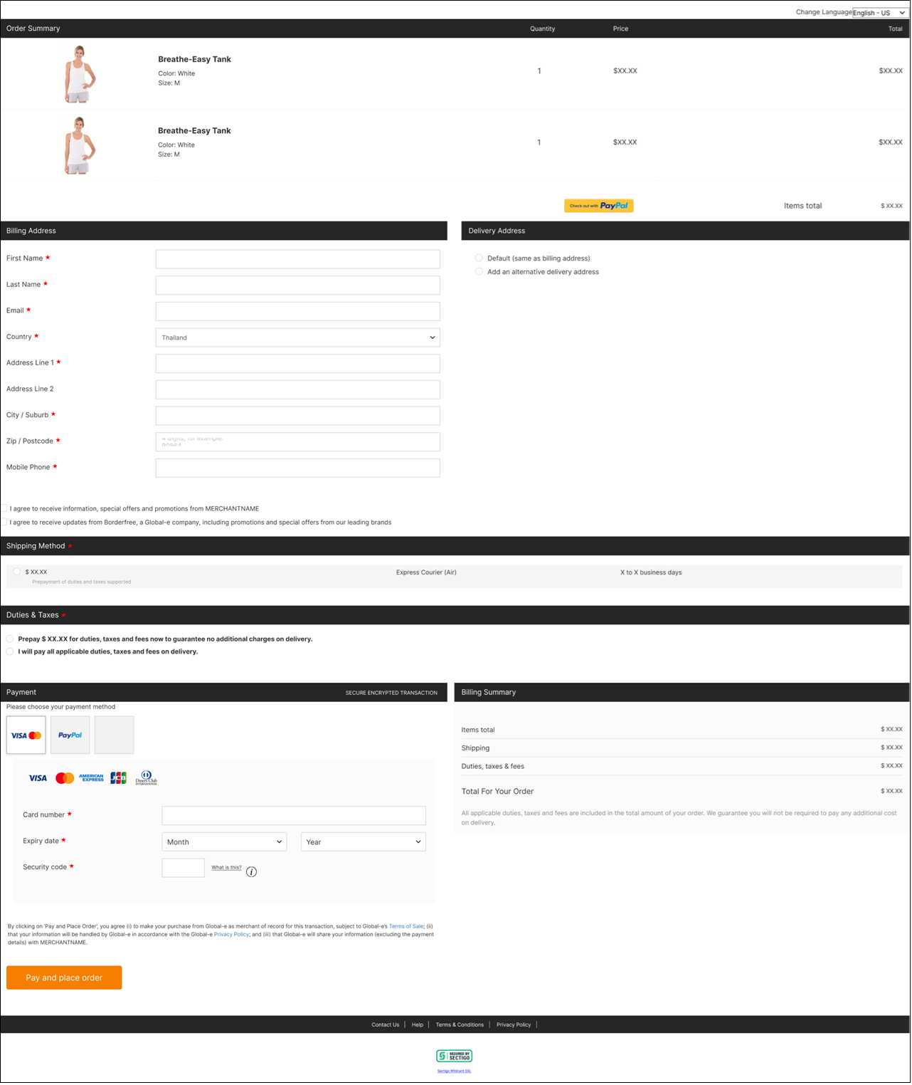
The Checkout page shows the following:
Order Summary
Billing and Shipping Addresses
Shipping Method
Billing Summary and Payment
The following figure shows the Desktop Checkout page:
The following figure shows the Desktop express checkout payment buttons:

The following figure shows the Mobile Checkout page:

The following figure shows the Mobile express checkout payment buttons:
