Country Switcher
Overview
This section does not apply to Shopify. For information about Shopify, see Shopify Native. |
The Global‑e Country Switcher, or Country Selector, is enabled by default after integration.
For countries operated by Global‑e, when Global‑e detects a customer browsing from a country that is not the Merchant's, the Country Switcher displays the customer's country or currency.
The shopper can change the country and currency combination that were automatically detected based on location.
For added convenience, Global‑e offers the option to customize the appearance and content of the Country Switcher, aligning it with your brand identity and design.
Note
The terminology for the Country Switcher varies depending on the platform, and it can also be referred to as the Country Selector or Shipping Switcher.
Design: Country Switcher
For added convenience, Global‑e offers the option to customize the appearance and content of the Country Switcher, aligning it with your brand identity and design.
Country Switcher Structure
The following figure shows the structure of the Country Switcher customizable elements.
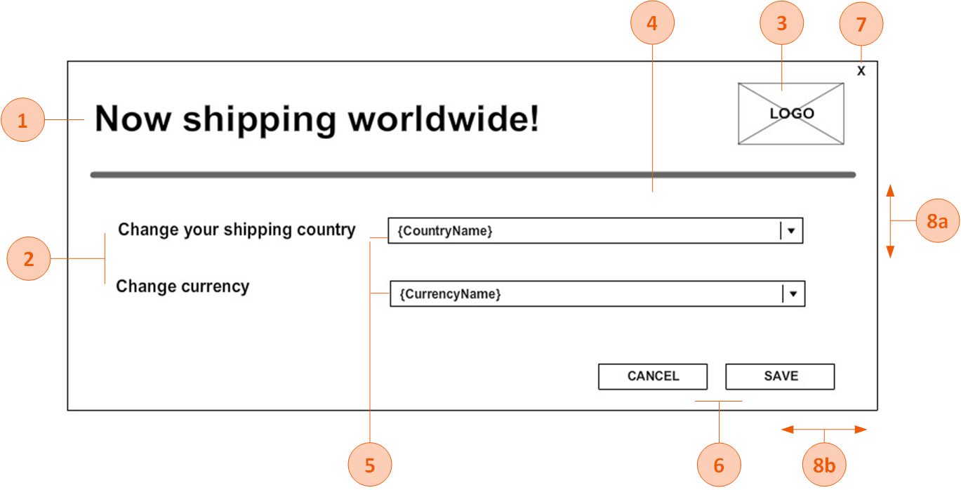
Country Switcher Customizable Elements
The following table lists the Country Switcher pop-up elements that can be customized.
Note: If fonts are not Google fonts, the merchant has to provide the font files in ttf /otf format
# | Element | Customizable |
|---|---|---|
1 | Title | Font style, font size, font color |
2 | Text | Font style, font size, font color |
3 | Logo | Image |
4 | Background | Background color, background image |
5 | Drop-downs | Font style, font size, font color, arrow style, background color, location (next to the text/below the text) |
6 | Buttons | Each button can be customised differently Font style, font size, font color, button color, button width, button height, button location coordinates (left, top) |
7 | X (close) button - on/off | If the X button is part of the pop-up, the image of the button can be part of the background image, and button location coordinates (left, top). |
8 | Size | 8a. Pop-up height 8b. Pop-up width |
File Format
Make sure to deliver the mock-up in any of the following file formats:
PSD
XD
Online design (example: https://zeplin.io/)
Image (recommended: JPEG or PNG. Other formats are also supported.)
PDF
Recommended Screen Dimensions for Desktop
The following table lists the Global‑e element dimensions recommended for the country switcher pop-up on desktop screens.
Desktop Dimensions
Element | Full Client Screen Size | Element Size |
|---|---|---|
Switcher pop-ups | W: 1920 X H: 1080px | W: 550 X H: 500px |
Recommended Screen Dimensions Mobile
The following table lists the Global‑e element dimensions recommended for the switcher pop-up on mobile screens.
Note
The height of the mobile screen adjusts dynamically to the contents of the checkout and confirmation screens per specific device. (The checkout page has more content than the confirmation page; the height adjusts accordingly). Therefore, the value of the screen's height is not required.
Mobile Dimensions
Element | Screen/Popup Width (px) (*) | Element size |
|---|---|---|
Switcher Mobile Pop-up | W: 375px | W: 340 X H: 285 |
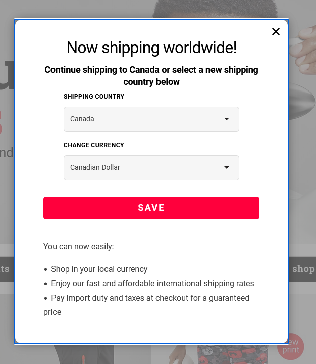
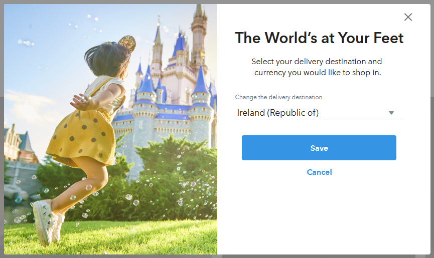
Country Switcher Pop-Up Examples
This section provides customization examples of the Country Switcher popup.
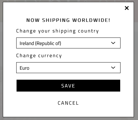
Country Switcher and Welcome Pop-up Combined