Site Customization
The Site Customization feature lets you set the look and feel and behavior of the following site usage stages:
Desktop vs Mobile Dimensions
Overview
Global-e Site Customization screens may render differently on Desktop and Mobile devices. This section describes the Desktop versus Mobile differences for each of the four customizable screen types (Welcome Pop-Up, Country Switcher, Marketing Banner, and Checkout) including recommended dimensions, customization scope, and any mobile-specific behavior.
All four screen types support 27 languages. Edits made to one language do not update the others. For consistency, apply translated changes manually across all language versions.
Deliver your mock-up in one of the following formats:
PSD
XD
Online design (e.g., Zeplin)
Image (PNG or JPEG recommended; other formats supported)
PDF
Tier Availability
The Desktop versus Mobile distinction applies across all merchant tiers (Enterprise, Pro, and NCE). However, which screen types a merchant can edit depends on their tier:
Screen Type | Enterprise | Pro | NCE |
|---|---|---|---|
Welcome Pop-Up | ✓ | ✓ | ✗ |
Country Switcher | ✓ | ✓ | ✗ |
Marketing Banner | ✓ | ✓ | ✓ |
Checkout | ✓ | ✓ | ✗ |
NCE merchants are restricted to the Marketing Banner screen only. For Pro and Enterprise merchants, all four screen types are available, and the Desktop versus Mobile distinction described in this section fully applies.
Welcome Pop-Up
Pop-Up Types
Variant | Description |
|---|---|
Desktop Welcome Pop-Up | Fully customizable pop-up supporting brand styling - fonts, images, background, and interactive elements. |
Mobile Welcome Pop-Up | Simplified pop-up with fixed dimensions, optimized for mobile devices. |
Customization Scope
Aspect | Desktop | Mobile |
|---|---|---|
Customization scope | Full customization of fonts, images, background, and interactive elements | Limited-only font size, style, and color are adjustable, provided that dimensions are correct |
Pop-up size | Configurable height and width | Fixed-cannot be resized |
Primary call-to-action | Standard action button | Action button is hidden; replaced by an inline text link |
Customizable Elements (Desktop)
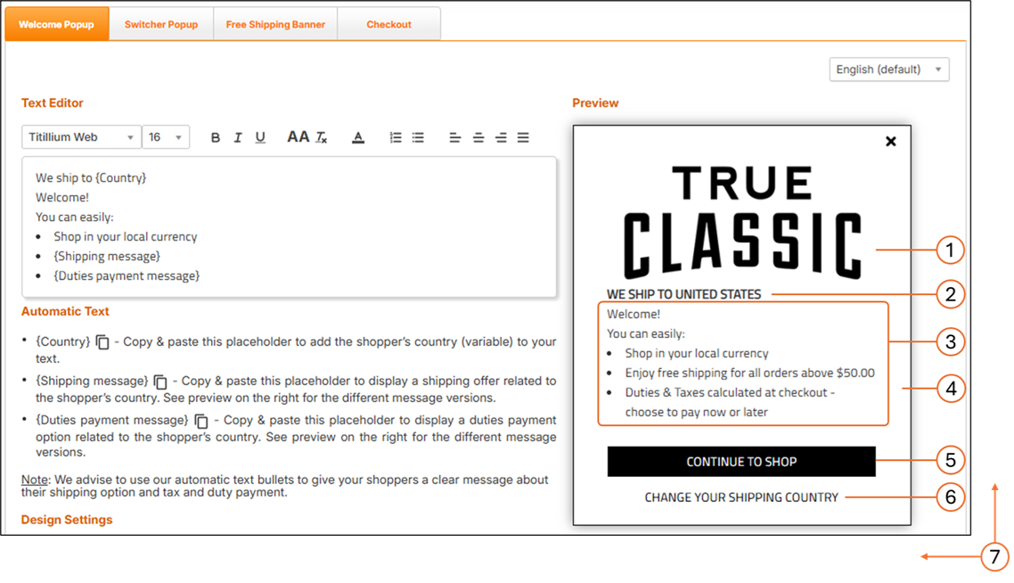
The following figure shows the Welcome Pop-Up screen on Desktop:
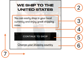
The following figure shows the Welcome Pop-Up screen on Mobile:
# | Element | What is Customizable |
|---|---|---|
1 | Logo | Image |
2 | Title | Font style, font size, font color |
3 | Message text | Font style, font size, font color |
4 | Background | Background color, background image |
5 | Action Button | Font style, size, color; button color; button width; button height; button location coordinates (left, top) |
6 | Link | Font style, size, color; link location coordinates (left, top) |
7 | Size | Pop-up height; pop-up width |
Note
If fonts are not Google Fonts, the merchant must provide the font files in .ttf or .otf format.
Mobile-Specific Behavioral Note
Following Google's 2017 Mobile Pop-Up Penalty, the mobile Welcome Pop-Up is disabled by default. Merchants who choose to enable it must comply with Google's "non-intrusive" mobile pop-up guidelines.
Recommended Dimensions
Element | Full Client Screen Size | Element Size |
|---|---|---|
Desktop | W: 1920 × H: 1080 px | W: 550 × H: 500 px |
Mobile | 375 px | W: 340 × H: 180 px (fixed) |
Country Switcher Pop-Up
Pop-Up Types
The following table shows the pop-up types:
Variant | Description |
|---|---|
Desktop Country Switcher Pop-Up | Fully customizable pop-up matching the look and feel of the website, with configurable dimensions and styling. |
Mobile Country Switcher Pop-Up | Simplified pop-up with reduced dimensions and a streamlined element set, optimized for mobile devices. |
Customization Scope
The following table shows the customization scope:
Aspect | Desktop | Mobile |
|---|---|---|
Customization scope | Full customization of styling, fonts, and elements | Reduced-main content area is replaced with a mobile-specific variant; certain desktop-only elements are hidden |
Pop-up size | Configurable height and width | Adjusted dimensions optimized for mobile (see Recommended Dimensions) |
Title font size | 24 px (default) | 21 px (default) |
Content padding | Standard padding for desktop layout | Reduced padding for mobile layout |
Recommended Dimensions
The following table shows the recommended dimensions:
Element | Full Client Screen Size | Element Size |
|---|---|---|
Desktop | W: 1920 × H: 1080 px | W: 550 × H: 500 px |
Mobile | 375 px | W: 340 x H: 285 px |
Note
The Mobile Country Switcher (340 × 285 px) is taller than the Mobile Welcome Pop-Up (340 × 180 px) to accommodate the country and currency selection content.
Shipping Banner
Rendering Across Devices
The Shipping Banner renders identically on Desktop and Mobile. There is no separate Desktop or Mobile variant-the banner uses a fluid container that spans the full width of its parent element on every device. The same configuration (background color, height, font, and text color) applies to all viewports.
Customization Scope
The following tables shows the customization scope:
Element | What is Customizable |
|---|---|
Background color | Color of the banner background |
Banner height | Specified in pixels by the merchant |
Font | Font family for the banner text |
Text color | Color of the banner text |
All four customization options apply equally to Desktop and Mobile.
Styling Precedence Note
Styling Precedence Note
If the container hosting the banner on the merchant's site includes its own CSS properties, the styling configured via the Site Customization editor may not take effect. In such cases, the merchant must adjust their container CSS to allow the banner styling to apply.
The following tables shows the recommended dimensions:
Aspect | Value |
|---|---|
Width | 100% of the container (fluid; not configurable) |
Height | Configurable in pixels by the merchant; no recommended fixed value |
Checkout Page
Page Variants
Variant | Description |
|---|---|
Desktop Checkout | Standard checkout layout including Order Summary, Billing and Shipping Addresses, Shipping Method, and Billing Summary / Payment, with full express checkout payment buttons. |
Mobile Checkout | Same content as Desktop, arranged responsively for mobile screen widths, with mobile-optimized express checkout payment buttons. |
Customization Scope
All Checkout customization options apply equally to Desktop and Mobile. The same configuration is served to both viewports-there is no separate mobile customization layer.
The following tables describes the customization scope elements:
# | Element | What is Customizable |
|---|---|---|
1 | Header Logo | Image / HTML |
2 | Background | Background color |
3 | Language Selector | Text font, drop-down input style |
4 | Titles Area | Background color, text font, text color |
5 | Order Summary Area | Product Name, Product Attributes, Qty/Price/Total, Items Total-each: font-face, size, color |
6 | Forms Styles | Input text-font-face, size, drop-down style |
7 | Billing Summary | Field titles and values-font-face, size, color (can differ for titles vs. values); Total title and value-same |
8 | Pay Button | Button background, font-face, size, color |
9 | Footer | Width, background, font-face, size, color |
Layout Note
The Checkout page layout is fixed and cannot be changed. This applies to both Desktop and Mobile.
Mobile-Specific Behavioral Note
On Mobile, the height of the Checkout screen adjusts dynamically to the contents of the checkout and confirmation screens for each device. The Checkout page typically contains more content than the Confirmation page, and the mobile height adjusts accordingly. For this reason, a fixed mobile height value is not required.
Recommended Dimensions
Desktop:
Element | Full Client Screen Size | Element Size |
|---|---|---|
Checkout / Confirmation | W: 1920 × H: 1080 px | W: 1000 px-auto height |
Mobile:
Aspect | Value |
|---|---|
Width | Responsive-adapts to the mobile viewport (no fixed width) |
Height | Dynamic-adjusts to content (see Mobile-Specific Behavioral Note above) |
Accessing the Customisation Page
To customize your page configurations, you must access the Customization page.
Navigate to Configuration > Customization from the top menu:

Select a merchant from the Merchant menu.
The following page is displayed.

Configure the elements above according to the table below:
No.
Element
Description
1
View, modify, and manage elements related to your Welcome popup screen.
2
View, modify, and manage elements related to your Switcher Popup screen.
3
View and modify your shipping banner page configuration.
4
Configure your checkout page.
Configuring Your Welcome Popup Page
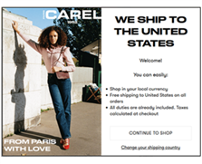
The Welcome Pop-Up displays a localized message to shoppers when they land on your store, helping communicate delivery eligibility, duties and tax logic, and any free-shipping thresholds. It supports full branding customization on Desktop and limited, fixed-size customization on Mobile.
From here, you can view, modify, and manage all elements related to your Welcome Pop-Up screen. The default language is English, with professionally translated versions available in twenty-seven languages to support your localization needs. This page includes a text editor preloaded with template content for your site’s pop-up message, along with a Preview panel located to the right of the editor.
From here you can configure the following, described below:
Message text (body and title)
Automatic text
Design settings
Preview options
The following figure shows the Welcome Pop-Up screen on Desktop:
The following figure shows the Welcome Pop-Up screen on Mobile:
The following table lists the customizable elements for Desktop and Mobile Welcome Pop-Ups.
# | Element | Customizable |
|---|---|---|
1 | Logo | Image |
2 | Title | Font style, font size, font color |
3 | Message text | Font style, font size, font color |
4 | Background | Background color, background image |
5 | Action Button | Font style, font size, font color; button color; button width; button height; button location coordinates (left, top) |
6 | Link | Font style, font size, font colour; link location coordinates (left, top) |
7 | Size | Pop-up height; Pop-up width |
Caution
If you edit the text in one of the language versions, the text edits are only applied to that specific language version - the text in the other language versions remains unchanged. To avoid having language versions with inconsistent text, when you edit the text of a specific language, apply the same (translated) text edits to the remaining twenty-six languages.
Three placeholders for automatic text (Country, Shipping message, and Duties payment message) are incorporated in the default text. We advise that you use our automatic text bullets to convey to your shoppers a clear message about their shipping options as well as tax and duty payment.
Follow steps 1 and 2 in Accessing the Customisation Page.
Modify the following elements:
Default language setting menu located above the Preview panel.
The English language version of the Welcome pop-up is viewed by site visitors from countries that do not have a localized (translated) version of the pop-up.
Automatic text (optional) to be used in your welcome popup message:
{Country} parameter: Informs shoppers that the goods can be delivered to their country.
{Shipping message} parameter: informs shoppers about the lowest cart range required to qualify for free shipping to their country.
{Duties payment message} parameter: informs shoppers about the duties payment option required for their country during checkout.
Note
When a customer visits your store, Global-e detects their location and automatically inserts the country name, and displays the relevant messages regarding shipping and duties & taxes.
Design settings (show/hide your logo).
Preview options:
Free shipping:
Available - Minimum order required for free shipping. Default message: Enjoy free shipping for all orders above $x
Unavailable - Free shipping not available. Default message: Enjoy our great international shipping rates
To all - Free shipping on all orders. Default message: Free shipping to (your country) on all orders
Duties at checkout:
Payable - Duties are displayed separately at checkout with the option to prepay. Default message: Duties & Taxes calculated at checkout - choose to pay now or later
Hidden - Duties are incorporated in the product price. Default message: All Duties & Taxes are already included - no hidden fees
Partial - Duties are incorporated in the product price, with taxes displayed separately at the checkout with the option to prepay. Default message: All duties are already included. Taxes calculated at checkout
Button message and formatting.
Normal and hover mode text, body, and border color settings.
Note
You can reset your settings to their default configurations by clicking Reset to default at the bottom of the page.
Screen Dimensions for Desktop and Mobile
The following table shows the recommended element dimensions for the Desktop screens or popup windows. The Mobile Welcome popup has a fixed size.
Element | Full Client Screen Size | Element Size |
|---|---|---|
Desktop | ||
Checkout / Confirmation | W: 1920 X H: 1080px | W: 1000px - auto height |
Welcome / Switcher pop-ups | W: 1920 X H: 1080px | W: 550 X H: 500px |
Mobile | ||
Mobile Welcome Pop-Up | 375 px | 340 × 180 px (fixed) |
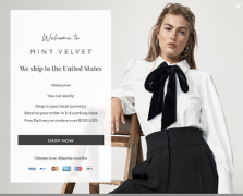
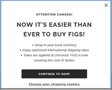
The following are some examples of Welcome popup screens:
 |  |  |  |
Note
Following Google’s 2017 Mobile Pop-Up Penalty, the mobile pop-up is disabled by default. Merchants who enable it must comply with Google’s “non-intrusive” guidelines.
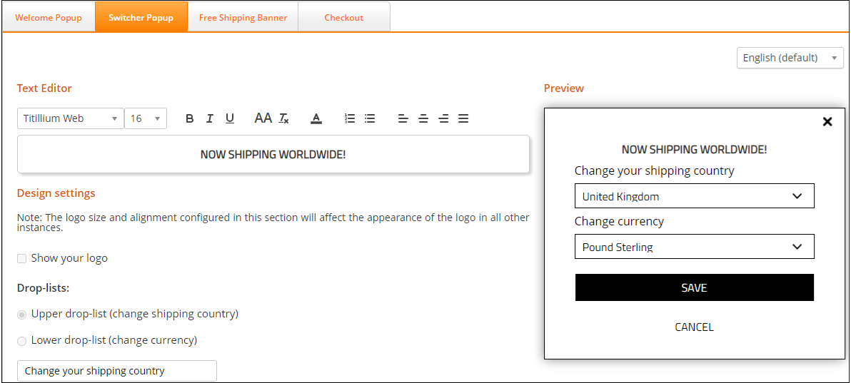
Configuring Your Switcher Popup Page
From here you can view, modify, and manage elements related to your Switcher Popup screen. This page includes a text editor containing some default template text to display as your site’s popup message. It also includes a Preview panel located to the right of the text editor.
Follow steps 1 and 2 in Accessing the Customisation Page.
Click Switcher Popup.
Modify the following design elements as needed:
Text editor
Design settings
Click Save or Cancel.
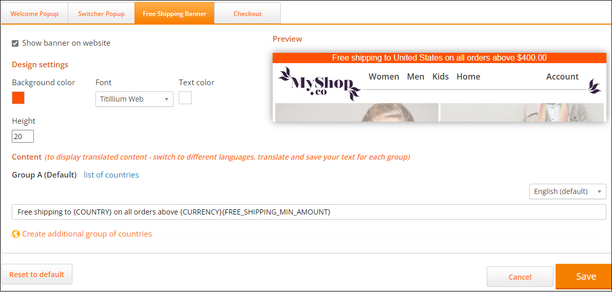
Configuring Your Shipping Banner Page
From here you can view and modify your shipping banner page configuration. A live preview of your configurations is displayed on the right side of the page.
Note that you can reset your settings to their default configurations by clicking Reset to default at the bottom of the page.
Follow steps 1 and 2 in Accessing the Customisation Page.
Click Free Shipping Banner.
Click Show banner on website.
Modify the Design settings section as needed.
Modify your list of countries (optional):
Click list of countries.
Select all of the relevant countries.
Click OK.
Select a language from the language menu on the far right of the page.
Enter the text of your shipping banner message in the text field.
Note
The text in the curly brackets pulls information from the database.
Create an additional group of countries (optional):
Click Create additional group of countries.
Select a continent from the map.
Select your countries from the Create a new group of countries panel.
Click OK.
Click Save.
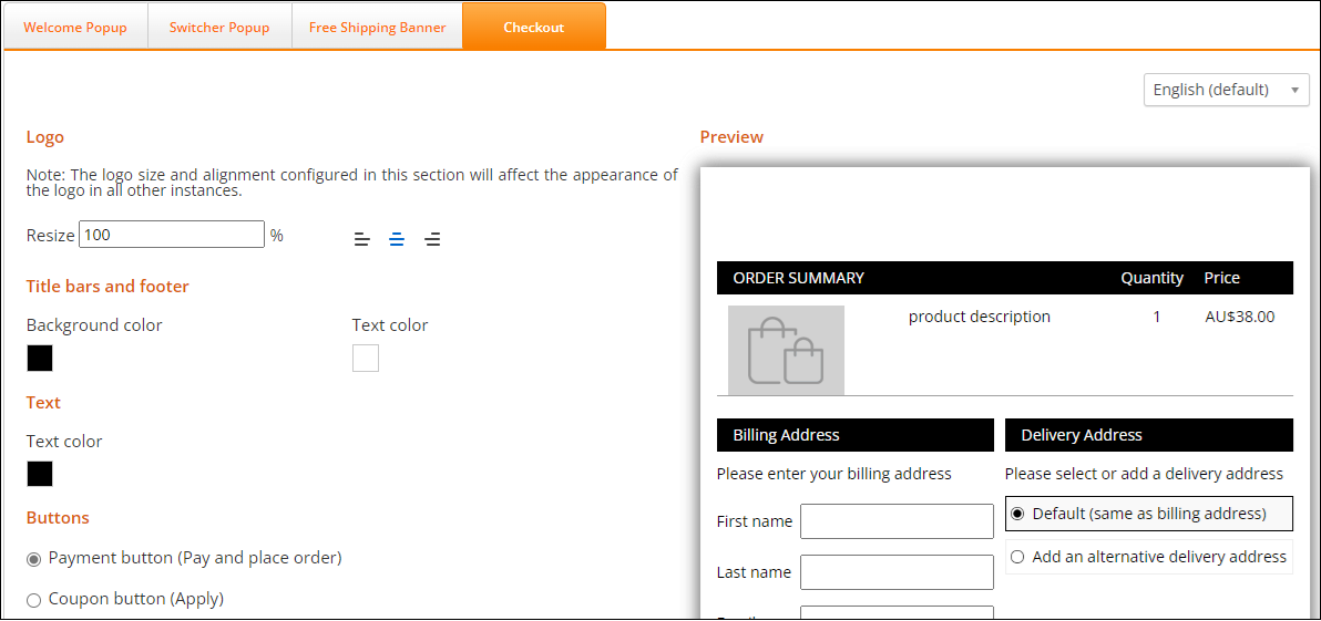
Configuring Your Checkout Page
This page describes how to configure your checkout page. A preview of your banner is displayed on the right side of the screen.
Note that you can reset your settings to their default configurations by clicking Reset to default at the bottom of the page.
Follow steps 1 and 2 in Accessing the Customisation Page.
Click Checkout.
Select a language from the language menu located at the far right of the page.
Modify the following design settings as needed:
Logo - Lets you resize and adjust the logo in all places where it appears, such as the Checkout page and customer facing notification emails.
Title bars and footer - Lets you set the background and text color of your title bars and footers.
Text - Lets you set the body text color.
Payment button (Pay and place order) - Lets you set the text, size, and text type of the Payment button
Coupon button (Apply) - Lets you set the text, size, and text type of the Apply button.
Normal mode - Lets you set the button text color, body color, and border color for the selected button (Pay and place order or Apply).
Hover mode - Lets you set the color shown when you hover over the selected button (Pay and place order or Apply).
Total price - Lets you set the color, font, size, and text type of the total price.
Click Cancel, Save, or Reset to default.
For examples of the appearance of the Checkout page, see Page Design.
Page Design
Customizing the Checkout and Confirmation Pages
This section details the items that are customisable on both the Checkout and Confirmation pages.
You can use this Figma page to make any customizations that you require. Duplicate and modify the file as needed.
Note
The checkout page layout is fixed (it cannot be changed).
For information about customizing your Checkout page, see Configuring Your Checkout Page.